Most digital products that fail commercially do not fail because the product is bad. They fail because the sales page does not do its job. A weak sales page turns a good product invisible. It forces the buyer to do work they will not do: figuring out what the product is, whether it applies to them, and whether it is worth paying for. Most buyers will not do that work. They will move on to the next option. Writing a strong sales page for a digital product is not about copywriting talent. It is about answering the right questions in the right order, clearly enough that the buyer can make a confident decision without needing to ask you anything.
This article walks through each section of a digital product sales page, what it needs to accomplish, and what separates the versions that convert from the versions that get ignored. It applies to any format: a Notion template, a PDF guide, a spreadsheet system, a mini-course, or any other digital deliverable.
What a sales page for a digital product actually needs to do
Before writing a single word, it helps to understand what a sales page is doing mechanically. A sales page is a one-page argument for a single decision: buy this or do not. Every element on the page either supports that argument or dilutes it. There is no neutral. A section that does not help the buyer decide faster and more confidently is a section that slows the page down and reduces the chance of conversion.
The argument the page makes follows a specific sequence. First, the buyer needs to recognize that the page addresses a problem they actually have. Without that recognition in the first few seconds, nothing else gets read. Second, they need to understand what outcome the product delivers, in terms specific enough to picture. Third, they need enough trust to believe the product delivers what it promises. Fourth, they need a clear, friction-free path to purchase.
That is the complete job of a sales page. Not to impress. Not to demonstrate how much work went into the product. Not to list every feature. To take a buyer who arrives with a problem and leave them with enough clarity and confidence to make a decision.
A sales page does not need to be long. It needs to be clear. Length without clarity loses the buyer. Clarity without length closes the sale.
The headline: the only part everyone reads
The headline is the most important element on a digital product sales page and the one most commonly written wrong. Most creators write headlines that describe what the product is. The buyer does not need to know what the product is in the headline. The buyer needs a reason to keep reading.
Write to the outcome, not the format
A headline that names the product format tells the buyer what they are looking at. A headline that names the outcome tells the buyer what their life looks like after using it. These are completely different things, and they produce completely different results.
“A Notion Template for Freelancers” is a product description. It tells the buyer what the file type is and who the general category of buyer might be. Nothing in that headline gives a reason to scroll. “Stop Losing Client Work to Scattered Notes and Missed Follow-Ups” names a specific frustration and implies a specific relief. A freelancer who has experienced exactly that frustration reads that headline and thinks: this is for me. That thought earns the next paragraph.
The formula that works consistently for digital product headlines is simple: name a specific frustration or desired outcome, address it to a specific type of person, and include enough detail to feel real rather than generic. Precision matters here. The closer the headline matches the buyer’s internal experience, the longer they stay on the page.
Test your headline against one question
Before settling on a headline, hold it against this question: would a stranger who fits your target buyer read this headline and immediately think “that is exactly my situation”? If the honest answer is maybe, or it depends, the headline is not specific enough. Write five alternatives and choose the one that would make your ideal buyer feel most directly recognized. Recognition is what earns attention. Attention is what earns the sale.
The opening paragraph: confirm the problem before presenting the solution
Once the headline earns the scroll, the opening paragraph has one job: make the buyer feel understood. This is where the page demonstrates that whoever built this product genuinely knows the problem, not in general terms, but with the kind of specificity that only comes from having lived it or watched others live it closely.
Describe the experience, not the category
Most sales pages open by describing a category of problem. “Managing client projects can be overwhelming.” That sentence is technically true for millions of people and meaningfully relevant to almost none of them, because it does not describe an experience. It describes a category.
Compare that with: “You have three active clients right now, four different tools open in your browser, and somewhere in that chaos is a brief a client sent last Thursday that you have not responded to yet.” That sentence describes a specific moment. The buyer who has lived that moment does not read it as marketing copy. They read it as recognition. Recognition creates trust faster than any testimonial or credential, because it answers the buyer’s first implicit question: does this person actually understand my situation?
Write the opening paragraph by describing the specific moment or feeling the product was built to address. Not the general problem. The specific experience of having it.
The solution section: what the product does, not what it is
After the problem has been named and the buyer feels recognized, the page introduces the product. This section makes the same mistake as the headline in most sales pages: it describes the product rather than describing what the product does for the buyer.
Lead with the transformation, follow with the format
The format of a digital product, whether it is a Notion template, a PDF, a spreadsheet, or a video course, is infrastructure. It is how the product is delivered, not why the buyer should want it. The solution section should lead with the transformation the product enables, then mention the format as supporting context.
“A complete client onboarding system that handles the first 48 hours of every new project automatically, delivered as a Notion workspace you can copy and start using today” leads with the outcome, then grounds it in the format. The buyer understands what changes for them before learning what file they are purchasing. That order matters. Buyers make emotional decisions first and justify them logically after. The transformation makes the emotional case. The format provides the logical support.
Be specific about what is included
Vague solution sections lose sales because they create uncertainty. “Everything you need to streamline your client process” tells the buyer nothing concrete. They cannot picture what they are buying, which means they cannot assess whether it is worth the price. Specific descriptions remove uncertainty. “A 12-page Notion workspace with intake form template, project brief structure, first-week timeline, and automated status tracker” gives the buyer something to evaluate. Specificity creates confidence. Confidence reduces friction at the moment of purchase.
The “what is inside” section: make the value visible
For most digital products, a dedicated section that itemizes the contents of the product serves a specific purpose beyond just listing features. It makes the value visible in a way that a prose description cannot fully accomplish.
Frame each item around its benefit, not its label
The difference between a “what is inside” section that converts and one that does not comes down to one question: does each item explain what it does, or just what it is called? “Client Intake Form” is a label. “Client Intake Form — captures every project detail upfront so you never chase missing information mid-project” is a benefit. Buyers reading the second version understand immediately why that item matters. Buyers reading the first version have to infer it, and many will not bother.
Apply this to every item in the list. For each one, ask: what does this do for the buyer specifically? What problem does this component solve or what outcome does it enable? Write the answer after the label, separated by a dash or a short phrase. This one change to the format of a “what is inside” section consistently increases the perceived value of a product without changing the product itself.
Social proof: building trust without an established reputation
For a creator launching a first digital product, social proof feels like the section that does not yet exist. That feeling leads most creators to skip it entirely, which is a significant mistake. A page without social proof is not neutral. Buyers trust it less than a page with any social proof at all, even minimal.
Four sources of social proof for a first launch
Beta testers are the most direct source. Before the public launch, give the product to three to five people who fit the target buyer profile and ask them for specific feedback. Even one or two sentences from someone who used the product and describes a specific outcome carries real weight on a sales page. “I used this for my first client project and finished onboarding in two hours instead of two days” is not a celebrity endorsement. It is a believable, specific account from a real person, and that is exactly what the section needs to do.
Community validation is the second source. If the problem your product solves comes up repeatedly in a community you are part of, a screenshot of that discussion, with identifying details removed if appropriate, demonstrates that the problem is real and widely shared. This is not a testimonial. It is evidence that the market exists.
Your own experience is the third source, and the most underused. If you built this product because you had the problem yourself, say so. “I built this after spending three months losing client briefs across four different apps” is a form of social proof. It tells the buyer that the product was built by someone with direct experience of the problem, which is more credible than a product built by someone researching a problem from the outside.
Results from the product itself are the fourth source. If you can show a before-and-after, a completed output, or a demonstration of the product in use, that visual evidence often does more work than written testimonials. A screenshot of a filled-in template, a completed workflow, or a finished document produced using the product shows the buyer what they are working toward.
The pricing section: how to present price without undermining the product
Price presentation is where many digital product sales pages inadvertently reduce the perceived value of the product right before asking for a purchase decision. The way a price is displayed communicates something about the product beyond the number itself.
Anchor before you reveal
Price anchoring means establishing a reference point for value before presenting the actual price. For a digital product, the most natural anchor is the cost of the alternative. If the product is a client onboarding template that saves three hours per project, and the creator bills at $50 per hour, that template is worth $150 per project to that buyer. Against that anchor, a $39 price point looks like an obvious decision, not an expense.
The anchor does not have to be a competing product. It can be the value of the time saved, the cost of the mistake the product prevents, or the outcome the product enables expressed in terms the buyer can translate into their own context. Set the anchor first. Present the price second. The number lands differently when the buyer already has a reference for what the outcome is worth.
Remove friction from the purchase moment
The moment a buyer decides to purchase is also the moment they are most likely to talk themselves out of it. Every additional step, form field, redirect, or load time between the decision and the completed purchase is an opportunity for hesitation to become abandonment. For a digital product, the payment process should be as simple as possible. A single click to the payment page, a clean checkout form, and an immediate delivery confirmation is the standard to aim for. Platforms like Gumroad handle this well by design, which is one of the practical reasons many first-time creators use them regardless of their payment processing situation.
The FAQ section: answer objections before they become exit points
Every buyer who arrives at a sales page with genuine interest but does not purchase left because an unanswered question became doubt, and doubt became an exit. The FAQ section exists to intercept those questions before they cause that exit.
Write the FAQ from real objections, not imagined ones
The most effective FAQ section comes from actual questions buyers asked before purchasing, not questions the creator imagines they might ask. For a first launch, those questions surface in outreach conversations, community discussions, and beta tester feedback. What did people want to know before committing? What hesitation came up more than once? Those questions belong in the FAQ.
Common categories worth covering for most digital products: what exactly is included and in what format, what level of experience is required to use it, whether it works with specific tools or platforms the buyer already uses, what happens if it does not work for them, and how quickly they will receive it after purchasing. Each answered question is one fewer reason to leave the page without buying.
The call to action: one clear next step
The call to action button and the text surrounding it close the argument the rest of the page has been building. Most calls to action on digital product sales pages fail because they are either vague (“Buy Now”), demanding (“Get Instant Access”), or disconnected from the outcome the buyer came for.
Connect the CTA to the transformation
A call to action that names the transformation the product delivers removes the last layer of friction between decision and purchase. “Get the Client Onboarding System” is better than “Buy Now” because it reminds the buyer what they are getting, not just that they are paying. “Start Onboarding Clients Without the Chaos” is better still because it names the outcome rather than the product.
Place the call to action at minimum twice on the page: once after the solution section, for buyers who are ready to purchase early, and once at the bottom of the page, for buyers who read everything before deciding. For longer pages, a third placement after the social proof section catches buyers who needed the trust before they were ready to act.
The one mistake that makes every other section irrelevant
A sales page can have a strong headline, a clear problem section, specific descriptions of what is inside, and genuine social proof, and still not convert if it targets the wrong person. Positioning a product for everyone is positioning it for no one. A buyer who arrives and feels like the product serves several different types of people, of which they are merely one, does not feel specifically addressed. Generic selling produces generic results.
Every section of the sales page should be written for one specific type of buyer. Not to the exclusion of everyone else, but with the specificity that makes that buyer feel directly recognized. The headline names their specific frustration. An opening paragraph that describes their exact experience earns their trust. Social proof drawn from people like them feels relevant rather than generic. FAQ answers written around their actual hesitations remove the last obstacles. A page written this way will occasionally miss a buyer who does not fit the profile. Among buyers who do fit it, conversion rates climb significantly.
The goal of a sales page is not to appeal to everyone who lands on it. It is to make the right buyer feel so specifically understood that not buying feels like leaving a solution on the table.
Writing the sales page is phase four of six
A strong sales page does not exist in isolation. It is one phase in a complete digital product launch process. The problem definition from Phase 1 tells you what frustration to name in the headline. Phase 2’s product scope tells you what to list in the “what is inside” section. The build from Phase 3 gives you screenshots and outputs to use as visual proof.
Writing the sales page before those earlier phases are complete produces a weaker result. Specificity on the page comes directly from the clarity built in earlier phases. A vague headline usually means the target buyer was never precisely defined. An unclear “what is inside” section usually means scope was never locked before building began. The sales page reveals the quality of the thinking that came before it. For a full walkthrough of how the phases connect, our guide to the six phases of a digital product launch covers each stage and its output.
The sales page template inside the Digital Product Launch System
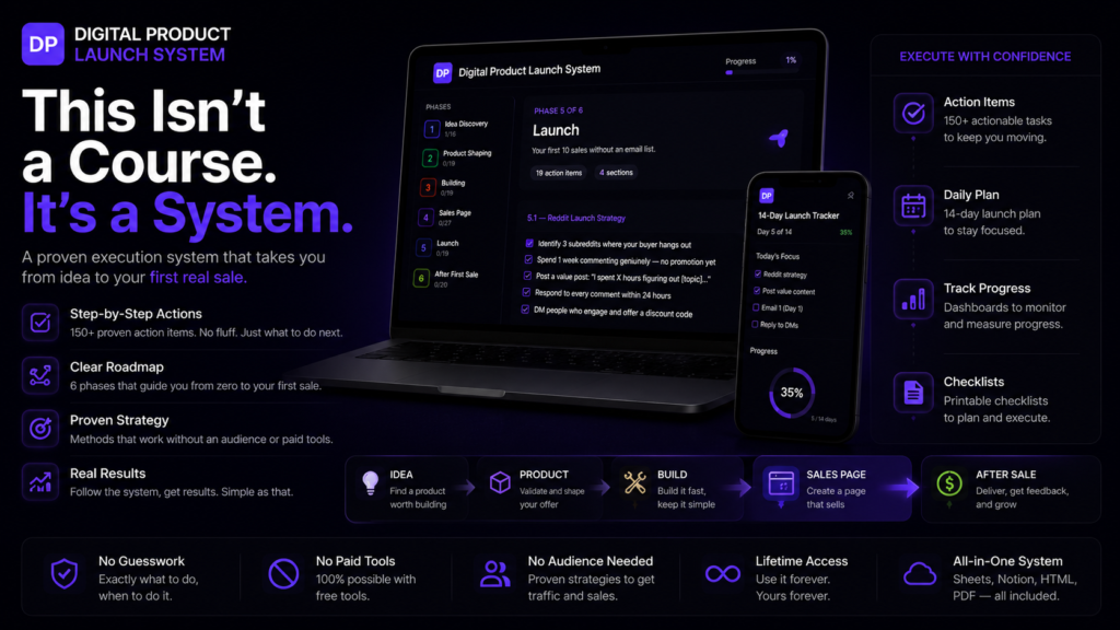
Every section covered in this article has a corresponding template inside the Digital Product Launch System. The sales page template inside the Notion Launch Workspace walks through each section in sequence: headline options, problem framing, solution description, what is inside, social proof placeholders, pricing presentation, FAQ structure, and call to action. Each section includes guiding questions that pull out the specific details needed to fill it, so the writing process becomes answering questions rather than staring at a blank page.
The template is built around the same logic this article covers: specificity over length, outcome over format, recognition over persuasion. It does not write the page for you. It structures the thinking that makes writing it significantly faster and the result significantly more likely to convert.
The Interactive Launch Guide that comes alongside the workspace explains the reasoning behind each section for creators who want to understand the why before filling in the what. The Google Sheets Launch Tracker includes a conversion tracking tab that records clicks, purchases, and conversion rate by traffic source so the page can be improved based on real data after the first launch.